The company’s late-April mobile overhaul, centered on a swipeable vertical feed, shows how quickly the boundaries between traditional streaming and short-form phone-first viewing are breaking down.
Netflix is making one of its clearest acknowledgments yet that the future of entertainment is not just about what people watch, but how they find it.
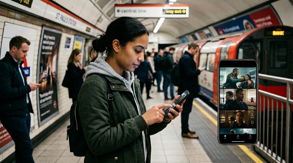
The streaming giant said it will roll out a redesigned mobile app by the end of April 2026, with the most eye-catching addition being a vertical video feed meant to help users discover shows and films more quickly on their phones. On the surface, the change looks like a straightforward product update. In practice, it is something larger: a recognition that the habits shaped by TikTok, Instagram Reels and YouTube Shorts are now influencing even the world’s biggest subscription streaming service.
For Netflix, the redesign is less a sudden imitation than the latest stage of a longer strategic evolution. The company has spent years experimenting with short-form discovery tools on mobile, from mobile previews in vertical format to comedy-focused clip feeds and kid-friendly short clips. It has also tested vertical discovery experiences more recently for its shows and movies. What makes the April 2026 update different is that the swipeable feed is no longer being treated as an experiment on the edges of the app. It is becoming part of the main product experience.
That shift matters because discovery has become one of the central problems in streaming. As libraries swell and users feel overwhelmed by choice, platforms are under growing pressure to shorten the distance between opening the app and pressing play. Netflix has long framed that problem in practical terms: help members browse less and watch more. But the mobile redesign suggests the company now believes that traditional rows, menus and static artwork are no longer enough for a growing share of phone-based viewing.
In its latest investor communication, Netflix said the redesigned mobile app would “better reflect our expanding entertainment offering” and make it easier for members to engage “how and when they want.” That wording is revealing. Netflix is no longer just a service for scripted series and films watched on television screens. It increasingly presents itself as a broader entertainment platform spanning series, films, games and live programming, and it has indicated that some newer formats, including video podcasts, perform especially well on mobile. The app redesign appears designed to match that wider ambition.
The vertical feed is the most visible symbol of that change because it imports the grammar of short-form social video into a subscription environment. Instead of asking users to browse across shelves or search by title, the app can place clips directly in front of them, one after another, in a familiar swipe-based rhythm. Netflix has previously said such feeds would let users immediately watch the full show or film, save it to My List or share it. In other words, the feed is not there to replace long-form viewing. It is there to accelerate the handoff from casual scrolling to committed watching.
That is an important distinction. Netflix is not becoming TikTok in any literal sense. Its business still depends on getting viewers to spend time with full-length premium content, not endless user-generated snippets. But it is borrowing the mechanics of short-form attention because those mechanics have become one of the most efficient ways to surface interest on mobile devices. The company appears to be betting that if people increasingly decide what to watch in the same way they discover everything else on their phones, then streaming services have to adapt or risk feeling slower, heavier and less intuitive.
The timing is also significant. Netflix introduced the redesign just as the broader entertainment market is confronting a blurring of categories that once looked more stable. Short-form platforms are financing more polished content. Streamers are adding live events, sports-adjacent programming and other formats that sit outside classic binge television. Mobile screens are no longer just secondary windows for trailers or catch-up viewing. They are becoming primary discovery engines, especially for younger users and for moments when people have only a few seconds to make a decision.
In that context, the redesign can be read as a defensive move, an offensive move, or both. Defensively, it is Netflix responding to a world in which attention is constantly being siphoned away by swipe-first apps. Offensively, it is Netflix trying to use its own vast library more efficiently by packaging discovery in a format people already understand instinctively. Rather than asking users to adapt to the platform, the platform is adapting to the user’s learned behavior.
This may also reshape the internal hierarchy of what gets promoted. A vertical discovery feed rewards content that can generate immediate intrigue in a few seconds: a striking visual, a compelling line of dialogue, a recognizable star, a twist that lands instantly. That does not mean slower or subtler titles cannot break through, but it does mean the packaging of content becomes even more important. In the years ahead, creators and marketers may pay even closer attention to which moments from a film or series can survive the brutal compression of the phone screen.
That possibility underscores why the redesign is more than a user-interface story. Product design influences taste. When platforms change the pathways through which audiences encounter content, they also influence which kinds of storytelling get noticed first. For years, Netflix helped normalize the streaming homepage as a place of algorithmic rows and autoplay trailers. A vertical feed could become the next such behavioral nudge, especially if it proves effective at turning short bursts of curiosity into full viewing sessions.
There is also a commercial logic behind the move. Better discovery can improve engagement, and engagement remains one of the most important drivers of retention and perceived value in subscription businesses. Netflix itself has repeatedly tied stronger engagement to better business outcomes. A mobile experience that gets people to titles faster, and that makes the service feel more responsive to phone-native behavior, could help the company keep members active in a more competitive entertainment market.
The redesign follows a period in which Netflix has been reworking multiple parts of its product ecosystem rather than treating the app as a finished utility. The company has already rolled out “My Netflix” as a dedicated mobile space for saved and personalized content. It announced a redesigned TV experience last year and linked that effort to new discovery tools, including vertical clip testing and conversational search. Seen together, the changes suggest Netflix is rebuilding discovery across screens, not merely adding a flashy mobile feature.
That broader pattern is what makes the late-April rollout especially noteworthy. For more than a decade, Netflix was often defined by the simplicity of a familiar grid-based streaming interface. Now it is rethinking that simplicity for an era in which the biggest competition is not another cable channel or even another streamer, but any app that can capture idle moments on a phone. In that environment, the homepage is no longer just a library entrance. It is a battleground for attention.
Whether users embrace the new design will depend on execution. Vertical feeds can feel efficient and addictive, but they can also feel noisy or too socially coded for viewers who still want streaming to feel more deliberate than social media. Some subscribers may welcome faster discovery. Others may resist if the app starts to feel like yet another scroll-heavy product. That tension will be one of the most interesting things to watch as the redesign rolls out.
Still, Netflix’s direction is unmistakable. The company is signaling that the old distinction between “watching streaming” and “scrolling your phone” is becoming less meaningful. Discovery, not just playback, is now central to the streaming wars. And as the line between premium entertainment and short-form browsing continues to blur, Netflix has decided that surviving on mobile means speaking the visual language users already know.
For the wider industry, that may be the most important takeaway. When the largest streaming service in the world redesigns its mobile product around a vertical feed, it does more than update an app. It legitimizes a new assumption about audience behavior: that even prestige entertainment increasingly has to be sold in the tempo of the thumb swipe.
That makes Netflix’s late-April redesign one of the most consequential lifestyle-and-tech media developments of the moment. It is not simply a cosmetic refresh. It is a strategic admission that in 2026, the first contest in entertainment often happens long before anyone commits to a full episode or film. It happens in the split second when a viewer decides whether to keep scrolling or to stay.